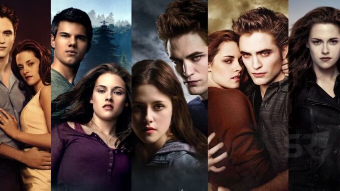
Each Twilight sequel looks distinctly different from the last, but why do Eclipse, Breaking Dawn, and New Moon have such divergent visual styles?
Each Twilight movie has a different visual palette from that of its predecessor, raising questions as to exactly why they all look so distinct. Each installment in the series represents a different interpretation of Stephanie Meyer’s original universe. However, given both the content of the stories and the personnel behind the camera, there are very good reasons for the visual discrepancies.
When original director Twilight Catherine Hardwicke first adapted Stephenie Meyers’ bestselling teen romance saga to the big screen, the movie proved an unexpected huge success at the box office. While Meyers’ novels were already a phenomenon, Twilight’s potential as a franchise was not clear until Hardwicke’s adaptation made millions upon release. As such, Twilight fans were surprised when Hardwicke was replaced by director Chris Weitz for 2009’s sequel, New Moon. This trend continued when Weitz himself was let go after one movie to make way for former music video helmer David Slade, who directed 2010’s Eclipse. Despite the third Twilight movie receiving solid reviews and being seen by many as the high point of the series so far, Slade was then replaced by Bill Condon for the Twilight franchise’s two-part ending Breaking Dawn.
The reasoning behind the Twilight franchise’s revolving door approach to directors has never been revealed, but the huge success of Twilight may have meant the studio didn’t want any individual director having too much say in the series. Whatever the cause, this approach results in each of the Twilight movies having a markedly different visual aesthetic, with a dramatic change in style between each movie in the series. While Breaking Dawn Part 1 and Breaking Dawn Part 2 both look alike thanks to the presence of director Bill Condon behind the camera, the two-part finale looks nothing like the third Twilight movie which, in turn, doesn’t resemble the first two movies in the series. The Twilight series cycled through numerous different styles, each of which reveals something about their director’s approach to the material.

Twilight’s Icy, Cold Original Movie
Catherine Hardwicke’s original Twilight saw the director trying to make melodramatic source material engaging and less cringe-inducing, resulting in her opting for a color palette of cool tones and icy blues. This improved the original Twilight’s reviews as, along with adding a murder mystery subplot, Hardwicke brought a grungey aesthetic seen in her earlier efforts Thirteen and Lords of Dogtown to the series. This style gave the original Twilight an edge that was missing from the more wholesome source novel and resulted in a huge hit with teen audiences— although some critics felt the blue-tinted visuals were as silly as the story. While not every reviewer loved the look, Twilight’s visual palette results in the first movie of the series being able to take itself seriously without lapsing into over-the-top self-parody (save for the unintentionally hilarious baseball sequence, that is).
New Moon’s Warmer, Autumnal Sequel
Chris Weitz’s New Moon brought much warmer tones to the series, along with a lighter tone in terms of story. Unfortunately, this change makes New Moon the weakest Twilight movie since the original Twilight was already light on plot, making the sequel a little too story-free for many critics and fans. The warm visuals were one of the otherwise-disliked New Moon’s high points, however, and did fit the sequel’s plot. As Bella warms to the hot-blooded Jacob Black and begins to move on from Edward, her world literally brightens and sheds the cool tones of the original Twilight. However, this idea is muddled by the movie’s climax, set in sunny Italy but centered around Edward. New Moon’s day-lit action movie climax is one of the Twilight franchise’s least effective sequences mainly because of how sunny and bright the scene is, a far cry from the original Twilight’s dark and gloomy denouement.
Eclipse’s Darker Third Installation
In 2010’s second Twilight sequel, the underrated Eclipse, 30 Days of Night director David Slade added more dynamic camera work, dramatic filters, and darker tones to a story that represents a tonal turning point in the series. A huge departure from the warmth of New Moon, Eclipse is the darkest Twilight in terms of visuals and story and was well-liked by both critics and fans as a result. Slade’s style reflects this, with literal black and white interludes accentuating the highly contrasted action. The climax cuts between a snowy, starkly white mountaintop and a muddy, grimy battle, and the contrast between the two proves effective, as does Slade’s potentially corny choice to frame Rosalie Hale’s tragic backstory as a black and white period piece.