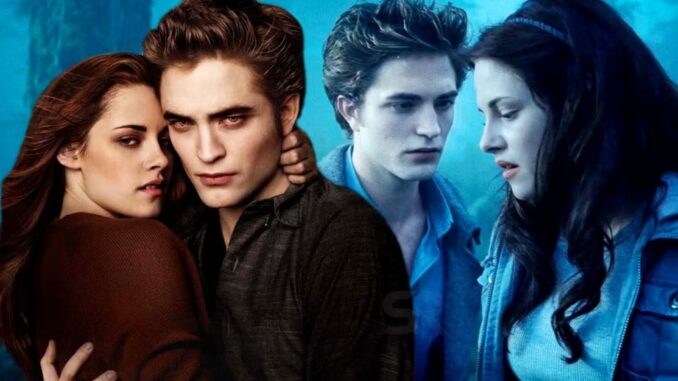
The first Twilight movie has a strong blue tint that was drastically changed for New Moon, and there’s a reason why this difference exists.
The Twilight Saga had different directors and with that came different styles, but there’s a huge difference between the first movie and the rest. It’s all about the color tone, as Twilight was very blue – here’s why it looks like that and why it changed. Vampires and werewolves have become some of the most popular monsters in pop culture, and in 2005, a new type of these creatures was introduced in the novel Twilight, written by Stephenie Meyer. The core of the four-book series was the problematic romance between human Bella Swan and vampire Edward Cullen, who came across different obstacles through the novels, including other vampire covens and wolf packs.
The Twilight novels were a big phenomenon, and it didn’t take long for them to make the jump to the big screen. The Twilight Saga movies were released between 2008 and 2012, with the final novel, Breaking Dawn, being split into two movies. While the saga didn’t do well with critics, it achieved its goal of appeal to its target audience and, most importantly, the fans of the books. The Twilight movies had different directors, with only Bill Condon directing two (both Breaking Dawn entries), meaning there are different approaches to the stories and characters, but also different visual styles. The biggest difference can be seen between the first two movies, Twilight and New Moon.
While critics weren’t pleased with the film’s story, they did praise Catherine Hardwicke’s direction of the first Twilight movie. She didn’t return to direct any of The Twilight Saga’s sequels, however. Instead, New Moon was directed by Chris Weitz, and this change was more evident in the visual style of the sequel film, including the color tone, which also changed because the focus of the story was different from that of the first Twilight film.

Twilight Without The Blue Tint
Twilight’s blue tint has even become something of an internet sensation as well, to the point that photos of Twilight without the blue tint circulated on Twitter, making it painfully obvious just how odd some of the scenes are. Of course, Twilight, New Moon, Eclipse, and Breaking Dawn are all highly meme-able already for a whole host of reasons, but the blue tint masks a lot of it by being extremely atmospheric. This is one reason why Twilight’s blue tint is actually a pretty good look for the franchise, and why Twilight without the blue tint just isn’t right. With realistic tones instead of the signature blue tint, Twilight ends up looking a bit silly, as the vampires all have odd fashion choices and tend to pose much more aggressively than is normal. Perhaps it would have benefitted The Twilight Saga to keep the blue tint consistent throughout the franchise, but there are actually sensible reasons why that’s not the case.
Why Twilight Has A Blue Tint & Why The Sequels Look So Different
Twilight has lots of blue and gray tones, which fit with the atmosphere of Forks and enhance the vampires’ pale complexes, but New Moon was given a much warmer look, with orange and brown tones. This is because Twilight’s main focus is Bella’s relationship with Edward and thus the introduction of vampires, while New Moon is more about Bella’s relationship with Jacob, her best friend, who is revealed to be a werewolf
The blue and gray colors of Twilight are more fitting with vampires given their coldness, figuratively and literally, while armer colors like orange and brown are more reminiscent of werewolves. This is especially true in the Twilight universe, where it’s revealed that werewolves’ body temperatures are a lot higher than that of regular humans, thus making them the opposite of vampires. The blue tones in Twilight can also be attributed to Catherine Hardwicke’s filmmaking style, as she used those same tones in the 2003 movie Thirteen, while Chris Weitz, who directed Twilight’s sequel movie, New Moon, has used warmer tones in his movies, such as American Pie and A Better Life.
The subsequent movies in the Twilight Saga had either more neutral colors or a combination of warm and cold, depending on the scene. This is the case with Eclipse, where the scenes involving the newborns and the battle were more blueish and cold. These are easy to miss details in the Twilight movies but they ultimately elevate the experience of watching them and show that, contrary to what many believe, there was attention to detail when making these movies.